
That's what I've been focusing on for the past 23 years. In doing so, I've gathered information that focuses on the resources needed to enable high-impact tutor/mentor programs to be available in more places. I've also built a library of links pointing to ideas about process improvement, collaboration, innovation, creativity, knowledge management and visualization. These represent skills that need to be learned, if we're going to do all we need to do so that great programs are not only available today, but are still available 10 or 15 years from now...with a growing network of students and adult alumni who are living lives free of poverty because of the long-term support they have received.
Understanding the flow of philanthropic dollars is essential. Below are three map images, pointing to three web sites where maps are being used in creative ways.
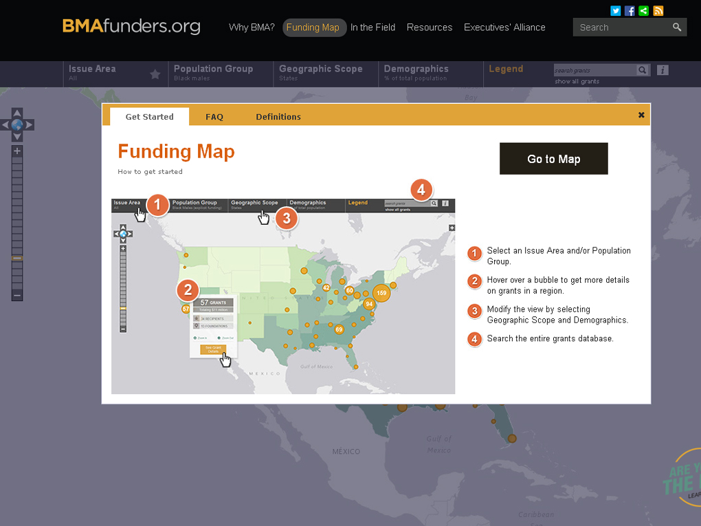
BMA Funders Map - Shows philanthropic support for organizations serving Black Male Youth and Adults. Sort by category, and zoom in to focus on different cities. Click on the yellow bubble and get detailed information.
Learning by Giving Foundation grants map.Since 2003 this foundation has partnered with colleges and universities around the country to teach philanthropic habits to students, who then raise money to support different non-profits. In the drop down menu you can sort by cause, college, year of donation, etc. Using the map you can zoom into different cities to see who was funded, and by what university.

Chronicle of Philanthropy map of on-line giving. I wrote about this last November. The image below was created by zooming into the Chicago region, then clicking on the 60623 zip code. The pop-up menu shows donations for an entire year (in this case March 2015-March 2016) and donations by category. This does not show the individual organizations receiving donations, but aggregates on regional levels. It enables a comparison of giving in different parts of the city, which quickly shows that high poverty neighborhoods receive less than more affluent areas. Note: this is not inclusive of all on-line donations, but only those made through Network for Good.

The last map is a map view created using the Chicago Tutor/Mentor Program Locator, which was launched by the T/MC in 2008, and which I've tried to keep available since 2015, via the Tutor/Mentor Institute, LLC. This first view shows the entire Chicago region, with overlays showing poverty areas, homicides in 2010, and locations of non-school tutor/mentor programs (green stars).


These maps illustrate the T/MC goal of collecting information that shows where non-school tutor/mentor programs are most needed, based on indicators such as poverty, violence, poor schools, etc. They also show what programs exist (based on surveys done since 1994) so that a) parents, volunteers and social workers can find programs; and b) so that leaders at the neighborhood and city level, including the business community, can build strategies that help existing programs get the resources they need to grow, while helping new programs form where more are needed.
There's more I've wanted to do. I'd like to be able to gather information on donations, as an overlay on this map, so leaders could see where more funds need to be distributed. In addition, I'd like to create an overlay that enables crowdfunding for the individual organizations shown on the map, and that collect information showing funds raised. This also would be used to try to influence greater giving in underfunded areas.
So far I've not found others who are creating map-directories for this purpose, although there are a growing number of organizations creating maps showing organizations in their networks (see list). In addition, I've not found platforms that map philanthropy, including maps showing a) indicators of need; b) existing providers; c) areas where more programs are needed.
I've never had consistent funding, or more than a few dollars to build the database, build and update the maps, create map stories, and use them to build public awareness, or to train others to use the program locator to create their own maps.
Yet I continue to share this with the goal that volunteers and investors/benefactors will come forward to help me upgrade my own platforms and share it with others so this strategy is applied in every city, not just in Chicago.
If you'd like to learn more about this use of maps, click here, or email me at tutormentor 2 at earthlink dot net.
No comments:
Post a Comment