In the map below I show participation in the 2017 Connected Learning on-line community, which you can find on Google+, Twitter, Facebook and other platforms.
 |
| view map |
If you look at the on-line spaces where #clmooc participants are connecting you'll see a wide range of interaction around ideas and around "making things" like music, postcards, coloring books, etc.

I'm interested in this because I've been trying to connect people who are involved in helping youth in high poverty areas get comprehensive support systems that help them from first grade all the way to first jobs, over a 20+ year period of support.
While I've attended Chicago conferences hosted by big foundations, universities and/or businesses, with as many as 500 or more people in the room, I don't feel that these really are interactive, where people in attendance are connecting deeply with speakers and other participants the way people in the #clmooc are doing.
I've found very few building participation maps as part of their on-going strategies.
Thus, I share the map and the idea in stories on this blog, and on the Tutor/Mentor blog. I can't make this type of engagement happen through my own limited efforts. However, by shining the spotlight on the #clmooc group and sharing this attention on social media, I can try to inspire and influence others to help make this happen.
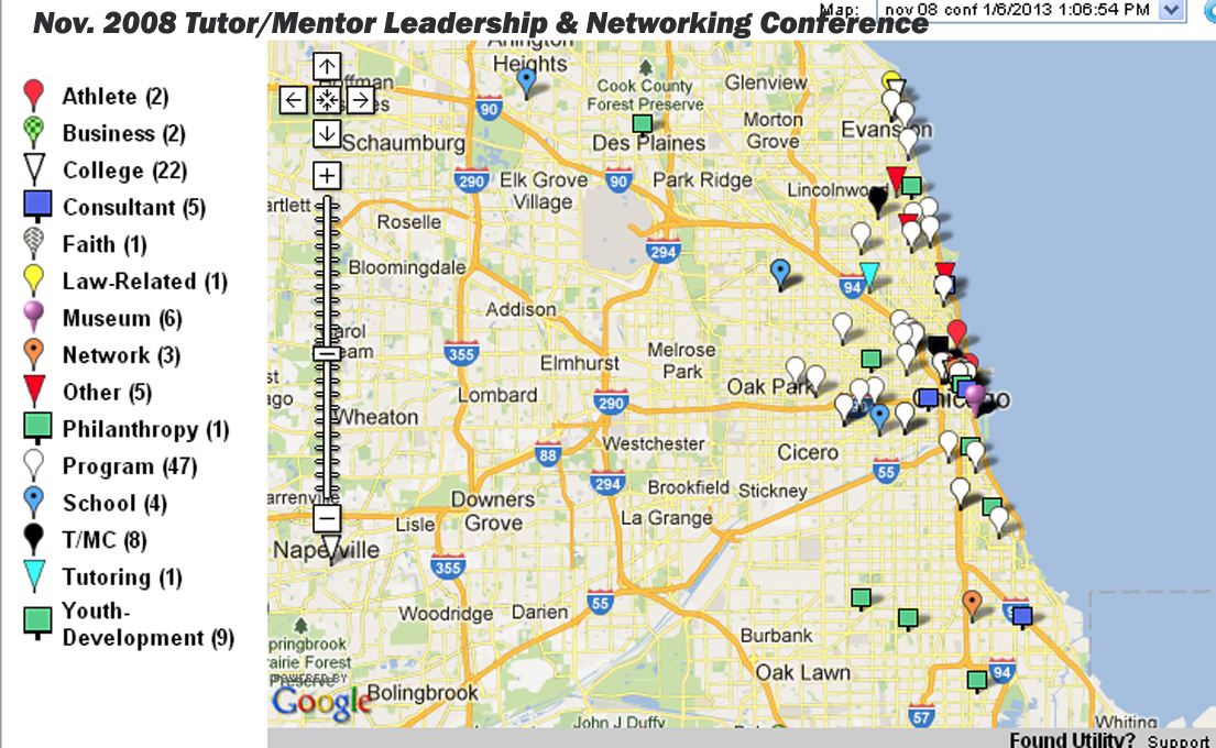 |
| Nov. 1998 conference map |
I hosted Tutor/Mentor Leadership and Networking Conferences in Chicago from May 1994 to May 2015 and created some maps to show participation. I've also created concept maps, to show the range of talent and networks I was trying to attract to the conferences, and to help me help tutor/mentor programs grow throughout the region.
You can see from viewing my maps that too few people from business, philanthropy, media, politics, universities and faith groups were attending the conferences I was hosting. You can also see, from viewing the #clmooc participation maps from the past three years, that too few people from Chicago or other urban areas are participating in their efforts.
You can change that by visiting the #clmooc site, joining the group, and adding your name to the map.
While participation ( or non-participation) in the Tutor/Mentor Conferences could be the topic of many discussions, my goal with this article is to encourage others to think about mapping participation in events they host (on-line and face-2-face) to show "who needs to be involved and interacting with each other" and "who is already involved"

Duplicate the #clmooc. Look at the image shown in this Tweet. Imagine many people from throughout the Chicago region, and the world, interacting and sharing ideas about who needs to be involved in on-going efforts intended to build and sustain needed youth and family service and jobs programs in every high poverty neighborhood of Chicago or other parts of the country, or the world.
Interested in helping? This could be an on-going project hosted by a college group, or even a high school service learning course. Tweet me @tutormentorteam or post a comment to this article if you're interested in exploring this idea.
No comments:
Post a Comment